DeliGo
DeliGo
Food delivery app case study
Food delivery app case study
By Piya Rianthong
By Piya Rianthong
DeliGo
Food delivery app case study
By Piya Rianthong

Overview
Overview
While food delivery apps have become an integral part of modern lifestyles, they often face several common challenges that negatively impact the user experience. Our app is designed to address these widespread issues head-on, offering innovative and user-centric solutions that set us apart from the competition.
While food delivery apps have become an integral part of modern lifestyles, they often face several common challenges that negatively impact the user experience. Our app is designed to address these widespread issues head-on, offering innovative and user-centric solutions that set us apart from the competition.
Problems
Problems
Difficulty finding preferred dishes or restaurants.
Complicated workflows frustrate users during checkout or customization.
Coupons are hard to find, apply, or understand.Complex membership and rewards systems confuse users.
Difficulty finding preferred dishes or restaurants.
Complicated workflows frustrate users during checkout or customization.
Coupons are hard to find, apply, or understand.Complex membership and rewards systems confuse users.
Solutions
Solutions
Personalized recommendations based on user needs
Easier ordering with easy customization
Clear and easy coupon management
Transparent and easy-to-follow subscription benefits
Personalized recommendations based on user needs
Easier ordering with easy customization
Clear and easy coupon management
Transparent and easy-to-follow subscription benefits
Research
Research
My research utilized a multi-faceted approach, including interviews, user personas, competitive analysis, and user journey mapping. This comprehensive strategy allowed us to deeply understand user pain points, evaluate industry benchmarks, and identify opportunities to create a more seamless, personalized, and engaging food delivery experience.
My research utilized a multi-faceted approach, including interviews, user personas, competitive analysis, and user journey mapping. This comprehensive strategy allowed us to deeply understand user pain points, evaluate industry benchmarks, and identify opportunities to create a more seamless, personalized, and engaging food delivery experience.
Interview
Interview
User Persona
User Persona
Competitive Analysis
Competitive Analysis
User Journey Map
User Journey Map
Finds
Finds
Users struggle to find food that matches their preferences easily.
Many apps have cluttered interfaces that overwhelm users.
Coupon systems are complicated and hard to use effectively.
Membership and rewards systems lack clarity and engagement.
Users desire a more intuitive, visually calming experience.
Interview
Interview
To understand user behaviors, pain points, and preferences in using food delivery app, focusing on aspects such as coupon usage, membership systems, and interface simplicity.
To understand user behaviors, pain points, and preferences in using food delivery app, focusing on aspects such as coupon usage, membership systems, and interface simplicity.
Participants
Participants
Number of Participants 6 individuals
Age 22–45 years old
Tech Savviness: Moderate to high
Usage Frequency: Weekly to daily users of food delivery apps
Number of Participants 6 individuals
Age 22–45 years old
Tech Savviness: Moderate to high
Usage Frequency: Weekly to daily users of food delivery apps
Key Areas of Focus
Key Areas of Focus
Finding Preferred Food
Finding Preferred Food
How do you typically search for food in a delivery app?
What challenges do you face in finding food that matches
your taste or dietary preferences?
Are there specific filters or features that would make this easier?
How do you typically search for food in a delivery app?
What challenges do you face in finding food that matches
your taste or dietary preferences?
Are there specific filters or features that would make this easier?
Participants
Participants
How would you describe your experience navigating food delivery apps?
What aspects of an app interface do you find overwhelming or distracting?
What design elements or layouts help you feel more at ease while using an app?
How would you describe your experience navigating food delivery apps?
What aspects of an app interface do you find overwhelming or distracting?
What design elements or layouts help you feel more at ease while using an app?
Interface Design and Usability
Interface Design and Usability
How would you describe your experience navigating food delivery apps?
What aspects of an app interface do you find overwhelming or distracting?
What design elements or layouts help you feel more at ease while using an app?
How would you describe your experience navigating food delivery apps?
What aspects of an app interface do you find overwhelming or distracting?
What design elements or layouts help you feel more at ease while using an app?
Coupon Systems
Coupon Systems
How often do you use coupons or promotional codes in food delivery apps?
What difficulties do you encounter when searching for, applying, or tracking coupons?
What would an ideal coupon system look like to you?
How often do you use coupons or promotional codes in food delivery apps?
What difficulties do you encounter when searching for, applying, or tracking coupons?
What would an ideal coupon system look like to you?
Membership and Rewards
Membership and Rewards
What would make membership and rewards systems more engaging and easier to understand?
What would make membership and rewards systems more engaging and easier to understand?
Coupon Systems
Coupon Systems
What features or experiences do you wish your food delivery app offered?
Are there specific pain points you experience with your current food delivery app?
What features or experiences do you wish your food delivery app offered?
Are there specific pain points you experience with your current food delivery app?
User Pain Point
User Pain Point
Through comprehensive interviews and detailed observation of user behaviors, I have uncovered several critical pain points that users commonly experience. These insights highlight the challenges that need to be addressed to enhance the overall user experience
Through comprehensive interviews and detailed observation of user behaviors, I have uncovered several critical pain points that users commonly experience. These insights highlight the challenges that need to be addressed to enhance the overall user experience


Difficulty in Finding Personalized Options
Difficulty in Finding Personalized Options
Through comprehensive interviews and detailed observation of user behaviors, we have uncovered several critical pain points that users commonly experience. These insights highlight the challenges that need to be addressed to enhance the overall user experience.
Through comprehensive interviews and detailed observation of user behaviors, we have uncovered several critical pain points that users commonly experience. These insights highlight the challenges that need to be addressed to enhance the overall user experience.
Cluttered and Overwhelming Interface
Cluttered and Overwhelming Interface
Complicated app layouts with too many features make navigation difficult, especially for users who prioritize simplicity and speed.
Complicated app layouts with too many features make navigation difficult, especially for users who prioritize simplicity and speed.
Confusing Coupons and Rewards Systems
Confusing Coupons and Rewards Systems
Users find it challenging to locate, understand, or apply discounts and rewards due to overly complex systems, resulting in missed savings opportunities.
Users find it challenging to locate, understand, or apply discounts and rewards due to overly complex systems, resulting in missed savings opportunities.
Lack of Clarity in Membership Benefits
Lack of Clarity in Membership Benefits
Membership tiers and rewards are often poorly communicated, leaving users unsure of the value they are receiving.
Membership tiers and rewards are often poorly communicated, leaving users unsure of the value they are receiving.
User Persona
User Persona
Through comprehensive interviews and detailed observation of user behaviors, I have uncovered several critical pain points that users commonly experience. These insights highlight the challenges that need to be addressed to enhance the overall user experience
Through comprehensive interviews and detailed observation of user behaviors, I have uncovered several critical pain points that users commonly experience. These insights highlight the challenges that need to be addressed to enhance the overall user experience


Competitive Analysis
Competitive Analysis
I analyzed the most popular food delivery apps in Thailand to find their strengths, weaknesses, and gaps as a way to create a more user-centric solution.
I analyzed the most popular food delivery apps in Thailand to find their strengths, weaknesses, and gaps as a way to create a more user-centric solution.

User Journey map
User Journey map
Through interviews, I’ve gained a clearer picture of my user’s experiences and challenges, leading to development of a user journey map that capture their journey step by step.
Through interviews, I’ve gained a clearer picture of my user’s experiences and challenges, leading to development of a user journey map that capture their journey step by step.

User Flow
User Flow
This user flow highlights the key interactions and processes users will encounter while using the Deligo app, ensuring a smooth and intuitive experience
This user flow highlights the key interactions and processes users will encounter while using the Deligo app, ensuring a smooth and intuitive experience

Wireframe
Wireframe
For DeliGo, I created mid-fidelity wireframes to focus on how the app works and how everything is laid out. It’s not about making it look perfect just yet but more about making sure all the important features are in the right place and easy to use. Starting with a mid-fidelity wireframe. I can make sure the app is functional and easy to use. before adding more detailed views later.
For DeliGo, I created mid-fidelity wireframes to focus on how the app works and how everything is laid out. It’s not about making it look perfect just yet but more about making sure all the important features are in the right place and easy to use. Starting with a mid-fidelity wireframe. I can make sure the app is functional and easy to use. before adding more detailed views later.

Usability Testing for DeliGo
Usability Testing for DeliGo
To evaluate the user experience of the DeliGo food delivery app prototype by observing real users interact with it and gather their feedback to identify pain points, improve usability, and refine the design.
To evaluate the user experience of the DeliGo food delivery app prototype by observing real users interact with it and gather their feedback to identify pain points, improve usability, and refine the design.
Participants
Participants
8 users representing the target demographic.
8 users representing the target demographic.
Prototype
Prototype
Mid-fidelity version with features like onboarding, menu search, ordering, coupon and membership benefits.
Mid-fidelity version with features like onboarding, menu search, ordering, coupon and membership benefits.
Test Tasks
Test Tasks
Sign up for an account.
Search for a restaurant and place an order (apply coupon and select payment).
Review a restaurant and rider.
Explore membership tiers and benefits.
Sign up for an account.
Search for a restaurant and place an order (apply coupon and select payment).
Review a restaurant and rider.
Explore membership tiers and benefits.
Post-Test Interview
Post-Test Interview
Gathered feedback on ease of use, confusion points, and improvement suggestions.
Gathered feedback on ease of use, confusion points, and improvement suggestions.
Success Rates and Observations
Success Rates and Observations
Task 1: Creating an account
Task 1: Creating an account
The instructions provided were easy to follow and the entire registration process was quick, so the participants had no difficulty completing it.
The instructions provided were easy to follow and the entire registration process was quick, so the participants had no difficulty completing it.

Task 2: Ordering from the restaurant by searching it first ( using a coupon and selecting a payment mode afterward)
Task 2: Ordering from the restaurant by searching it first
(using a coupon and selecting a payment mode afterward)
Most of the participants did not face any issues while searching and ordering, however 4 of them got confused about how to apply the coupon when it came to the issuing of promo codes.
Most of the participants did not face any issues while searching and ordering, however 4 of them got confused about how to apply the coupon when it came to the issuing of promo codes.

Task 3: Rate the restaurant and the rider
Task 3: Rate the restaurant and the rider
The rating system’s interface was minimalistic which a lot of the participants found appealing. But, some of them proposed that tags allowing for quicker reviews be added to the interface.
The rating system’s interface was minimalistic which a lot of the participants found appealing. But, some of them proposed that tags allowing for quicker reviews be added to the interface.

Task 4: Visit the membership section which has membership levels and the advantages of each level
Task 4: Visit the membership section which has membership levels and the advantages of each level
Participants deemed the membership details as thorough but rather too much to process at once. A number of participants however found it helpful to have a visual representation of a progress bar to indicate how far along the individual is to getting a certain tier level.
Participants deemed the membership details as thorough but rather too much to process at once. A number of participants however found it helpful to have a visual representation of a progress bar to indicate how far along the individual is to getting a certain tier level.

Pain Points and Solutions
Pain Points and Solutions
Through comprehensive interviews and detailed observation of user behaviors, I have uncovered several critical pain points that users commonly experience. These insights highlight the challenges that need to be addressed to enhance the overall user experience
Through comprehensive interviews and detailed observation of user behaviors, I have uncovered several critical pain points that users commonly experience. These insights highlight the challenges that need to be addressed to enhance the overall user experience

Visual Design (High-Fidelity UI)
Visual Design (High-Fidelity UI)
The Visual Design (High-Fidelity UI) for Deligo focuses on building a user-friendly interface. These designs act as the blueprint for the app’s main screens, emphasizing clear layouts, simple structures, and smooth functionality. Created with user needs in mind, they directly tackle the pain points found earlier, making the app easy and enjoyable to use.
The Visual Design (High-Fidelity UI) for Deligo focuses on building a user-friendly interface. These designs act as the blueprint for the app’s main screens, emphasizing clear layouts, simple structures, and smooth functionality. Created with user needs in mind, they directly tackle the pain points found earlier, making the app easy and enjoyable to use.

Design system
Design system
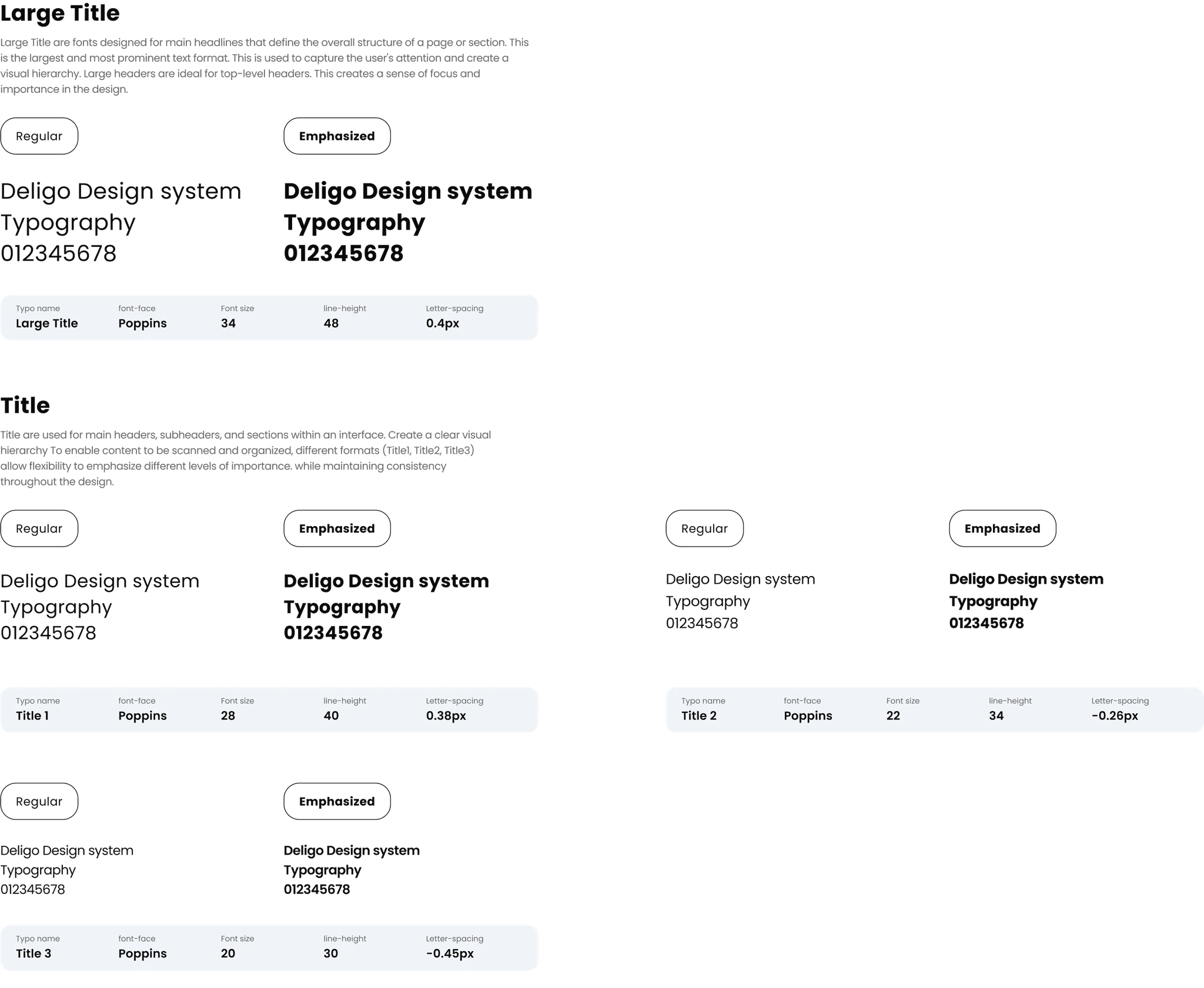
Typography
Typography
The typography has been designed to maintain consistency and legibility across the interface while offering flexibility for unique content needs. Each type style has been carefully crafted to serve a specific purpose, ensuring a clear and user-friendly experience.
The typography has been designed to maintain consistency and legibility across the interface while offering flexibility for unique content needs. Each type style has been carefully crafted to serve a specific purpose, ensuring a clear and user-friendly experience.


Semantic Color
Semantic Color
This design system's color palette has been carefully designed to maintain consistency and clarity throughout the app. Each character is assigned a specific role. From highlighting the main action to creating a clear visual hierarchy. A smooth and user-friendly experience is guaranteed throughout the interface.
This design system's color palette has been carefully designed to maintain consistency and clarity throughout the app. Each character is assigned a specific role. From highlighting the main action to creating a clear visual hierarchy. A smooth and user-friendly experience is guaranteed throughout the interface.


Button Component
Button Component
Button components are key interactive factors designed to offer clear, actionable instructions to users. It has been designed to have a distinct appearance and sense this is constant across the interface. Ensures user interaction and pride. Components help various states and sizes. To match extraordinary contexts even as keeping readability and accessibility.
Button components are key interactive factors designed to offer clear, actionable instructions to users. It has been designed to have a distinct appearance and sense this is constant across the interface. Ensures user interaction and pride. Components help various states and sizes. To match extraordinary contexts even as keeping readability and accessibility.

Accessibility
Accessibility
My app is designed with inclusivity in mind, ensuring that all users, including those with visual impairments or color vision deficiencies, can enjoy a seamless experience.
My app is designed with inclusivity in mind, ensuring that all users, including those with visual impairments or color vision deficiencies, can enjoy a seamless experience.
Test Tasks
Test Tasks
Color Contrast Compliance
Color Contrast Compliance
I rigorously monitor and use color contrast ratios that meet or exceed WCAG AA standards, ensuring readability of all text and UI elements. Even for users with impaired color vision.
I rigorously monitor and use color contrast ratios that meet or exceed WCAG AA standards, ensuring readability of all text and UI elements. Even for users with impaired color vision.
User-Friendly Design
User-Friendly Design
The app interface has been designed to reduce visual stress. Using clear fonts Easy to use format and color tones to suit the needs of various users
The app interface has been designed to reduce visual stress. Using clear fonts Easy to use format and color tones to suit the needs of various users

Summary of Improvements
Summary of Improvements
The app was made easier to use and navigate as a result of the redesign. As part of the key updates, improved support of food likes, easy to use coupons and distinguishing tier memberships were introduced. With these modifications, the app is more useful and easy to operate.
The app was made easier to use and navigate as a result of the redesign. As part of the key updates, improved support of food likes, easy to use coupons and distinguishing tier memberships were introduced. With these modifications, the app is more useful and easy to operate.

Outcomes and Impact
Outcomes and Impact
The new design of the app has grown the user engagement and satisfaction rates to a whole new level.
The new design of the app has grown the user engagement and satisfaction rates to a whole new level.
Raised Usability: During navigation the time spent to finish tasks decreased which resulted in an 85% user satisfaction.
Raised Usability: During navigation the time spent to finish tasks decreased which resulted in an 85% user satisfaction.
Personalized Experience: By having food preferences made, there was a 60% increase of users engaging with the feature containing custom made options.
Personalized Experience: By having food preferences made, there was a 60% increase of users engaging with the feature containing custom made options.
Improvements in Engagement Rate: There was a 50% increase in the usage of the membership feature and a 40% increase of coupon usage, indicating a growing amount of users interacting with the perks of having an account.
Improvements in Engagement Rate: There was a 50% increase in the usage of the membership feature and a 40% increase of coupon usage, indicating a growing amount of users interacting with the perks of having an account.
Reflection
Reflection
This project showed how user feedback improves design. Testing revealed hidden issues, and small changes made a big difference in usability. Consistency across screens was also critical.
This project showed how user feedback improves design. Testing revealed hidden issues, and small changes made a big difference in usability. Consistency across screens was also critical.
Post-Test Interview
Post-Test Interview
Gathered feedback on ease of use, confusion points, and improvement suggestions.
Gathered feedback on ease of use, confusion points, and improvement suggestions.
Next Steps to be Adopted
Next Steps to be Adopted
Test the updates to ensure they work well.
Add features like better search and more customization
Keep improving based on user feedback.
Test the updates to ensure they work well.
Add features like better search and more customization
Keep improving based on user feedback.
Piya Rianthong
Piya Rianthong
piyarianthong@gmail.com
piyarianthong@gmail.com
(+66) 972044777
(+66) 972044777
UX/UI Case Study
UX/UI Case Study
DeliGo Food delivery app
DeliGo Food delivery app